

This page highlights the forex pairs making the biggest price moves in the strongest trends. You may find this useful for identifying swing trades based on strongly trending forex pairs.
Best Swing Trading Currency Pairs – Updated Weekly
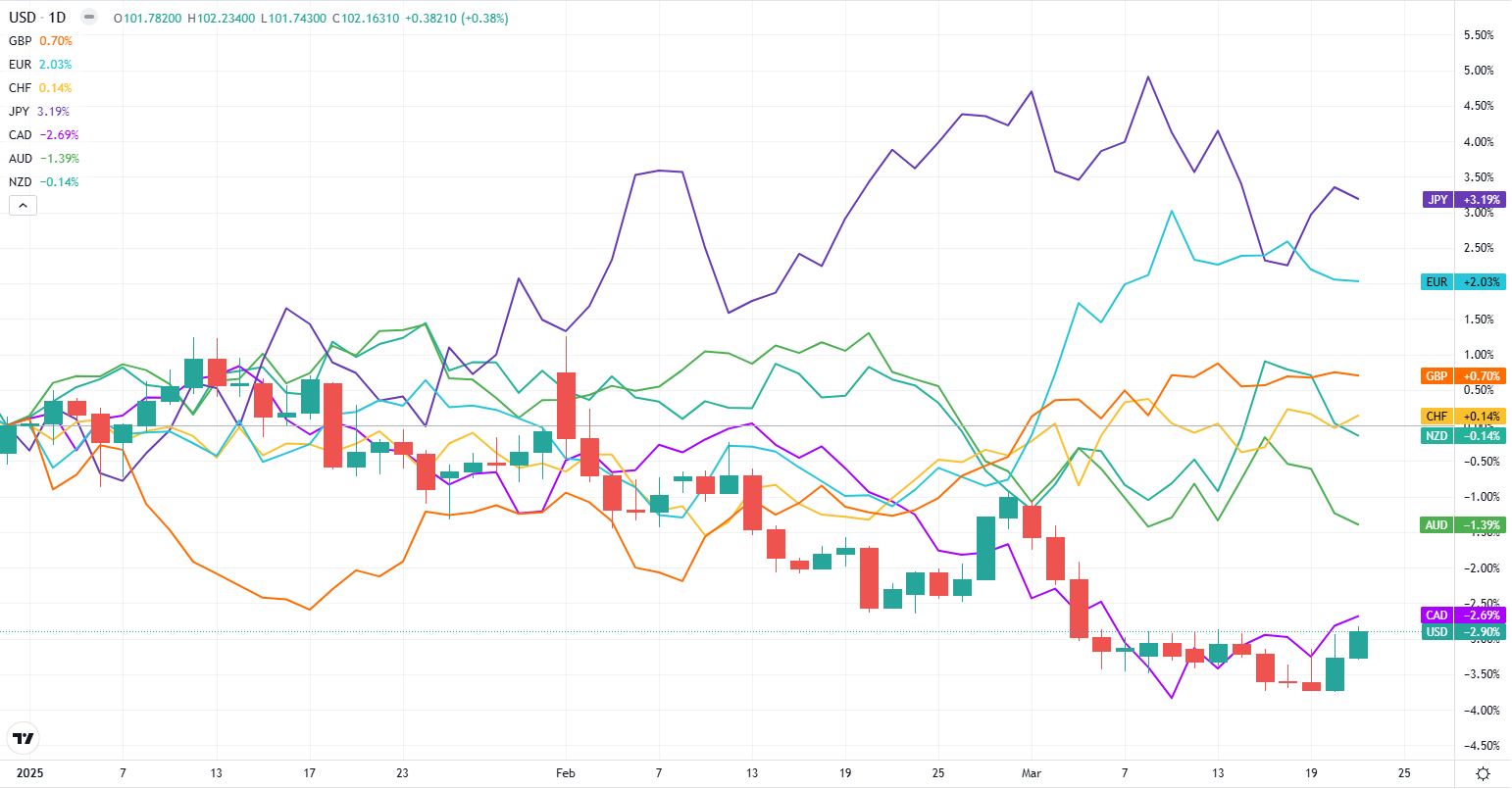
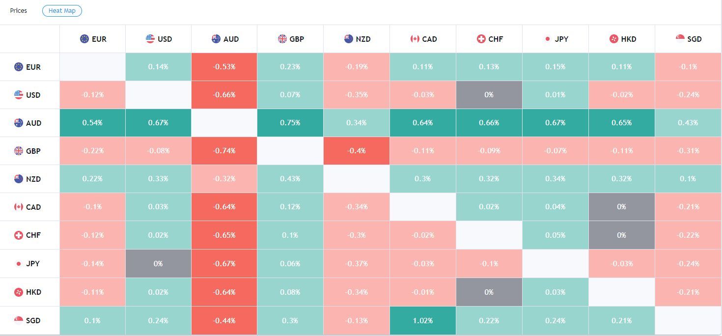
The following chart shows how currency baskets or indices are performing relative to each other over the last 2.5 months. Combine strengthening and weakening currencies to see which pairs are likely in the strongest trends or emerging trends. How the indices are calculated, and how to use this chart, are discussed below.
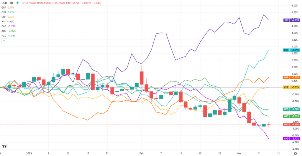
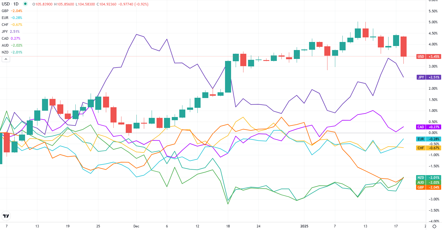
The following chart was updated on March 23.
Currency index data courtesy of Mataf.
Best Forex Pairs for Swing Trading This Week:
EUR/USD – Ripped higher recently. Pay some daily interest for being long.
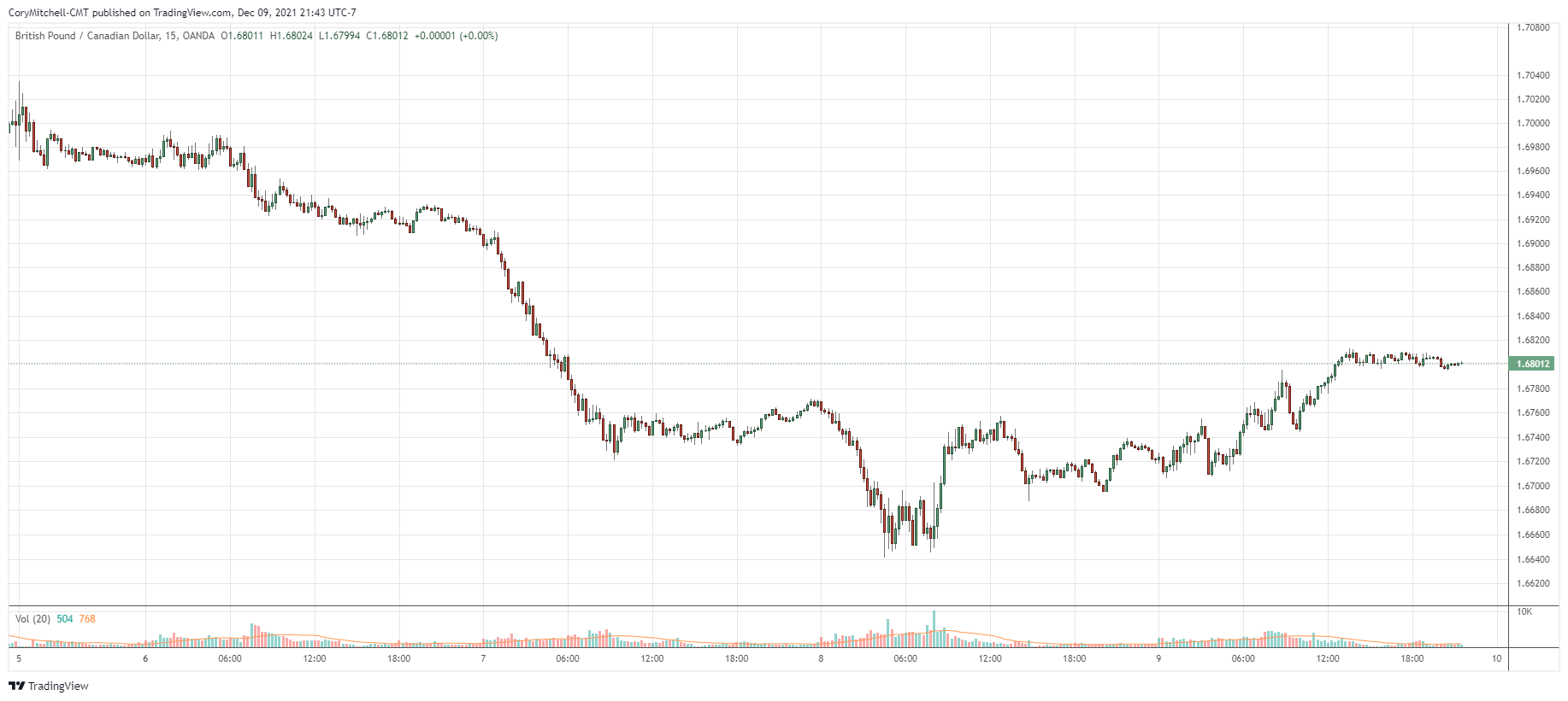
EUR/CAD – Ripping higher. Pay small daily interest for being long. EUR/AUD similar but recent up-moves not quite as strong. GBP/CAD also quite strong.
USD/JPY – Trending lower. Pay daily interest for being short. I prefer to wait for longs to collect the interest as well. Near potential support area. CAD/JPY similar and near possible support area.
Forex developments over the last couple of weeks:
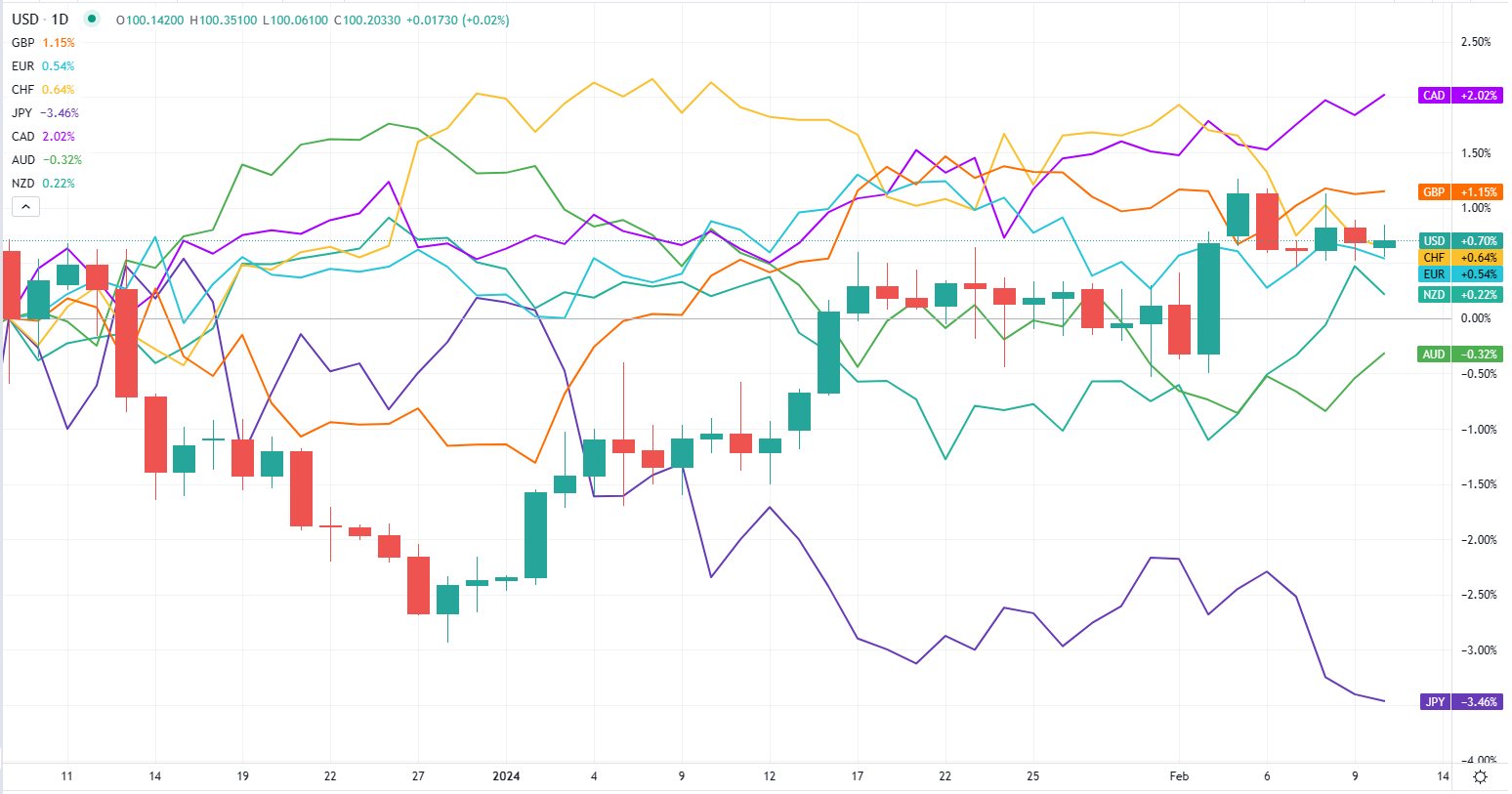
NZD, CAD, USD, GBP, EUR are up.
CHF, AUD, JPY are down.
JPY still has much lower interest rates than the rest of these currencies/countries. The carry trade is likely to come back into play as investors chase interest income and potential capital gains.
Want to learn how to swing trade currencies, including strategies, and how to adapt to changing market conditions? Check out the Forex Swing Trading Course.
Why Trade Forex Pairs Composed of a Strong and Weak Currency?
Forex swing traders are constantly faced with having to choose one pair over another. Maybe you find yourself contemplating a long trade in the AUD/USD and NZD/USD. Both have similar setups, but is one a better option at a given time?
Or maybe you’re faced with a short EUR/USD or GBP/USD trade. Which one’s more favorable?
[When day trading, I only trade the EURUSD on the 1-minute chart.]
Or maybe you just want to see which currency pair is strongest or weakest to seek out some trading opportunities.
We’re constantly faced with tradeoffs. If you’re bullish on the USD, you could buy the USD related to any currency, and maybe that will work out. But ideally, buy the USD against a currency that’s weak.
This goes for any currency. If you want to buy euros, buy the EUR against a currency that’s weak. If you want to sell GBP, sell it against a currency that is strong.
Pair weak with strong in order to maximize the efficiency of a trade.
If you buy the USD because it is acting strong, and the AUD is also acting strongly, it doesn’t make sense to sell AUD/USD (sell AUD and buy USD). The pair may not move much since both currencies are strong. If JPY is weak, it makes more sense to buy USD/JPY, this way you take advantage of the USD strength and JPY weakness, which will likely result in a much larger and more predictable price move.
Where to Find Strength and Weakness Data
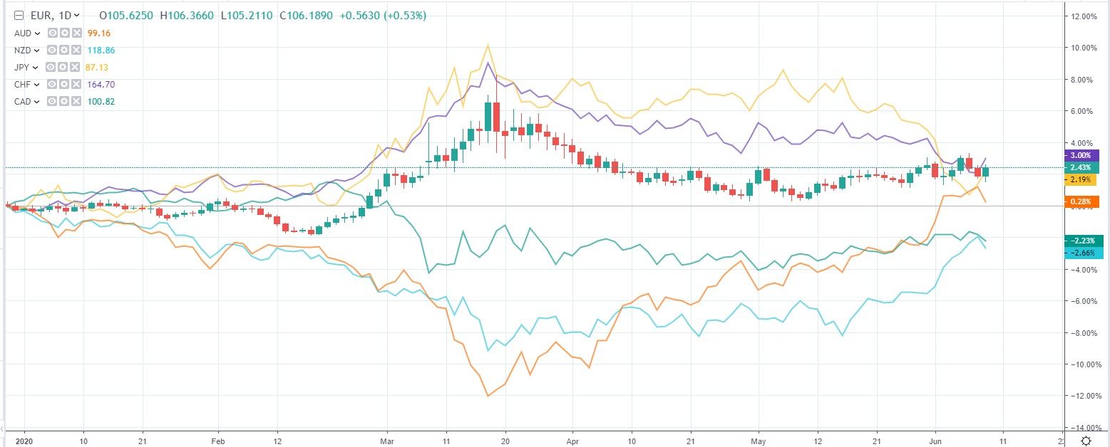
For a quick glance at which currencies are strong or weak, I like to look at the currency indexes available on Mataf.net. Check the site for live data. The chart above is a recent snapshot.
Charts are provided as examples only. Please see Mataf.net for current information. The chart below is an example from 2020.
If you’re a short-term trader swing trader, check one week of data. If your trades last several days to several weeks, a month or two of data may be most useful.
The idea is to check the data regularly, and then attempt to be long the strongest currencies against (short) the weakest.
Look for trading opportunities where one currency index is moving up while another currency index is moving down. This will create a currency pair to watch. Alternatively, it will help you narrow down which pairs you want to trade with the Price Structure swing trading method.
On the chart above, in mid-March, we could see that the AUD had been moving up, while CHF and JPY had been moving down. That indicates there may be some good trades in AUDCHF and AUDJPY while this is happening. And there was, as the pair rose strongly in a rising trend channel.
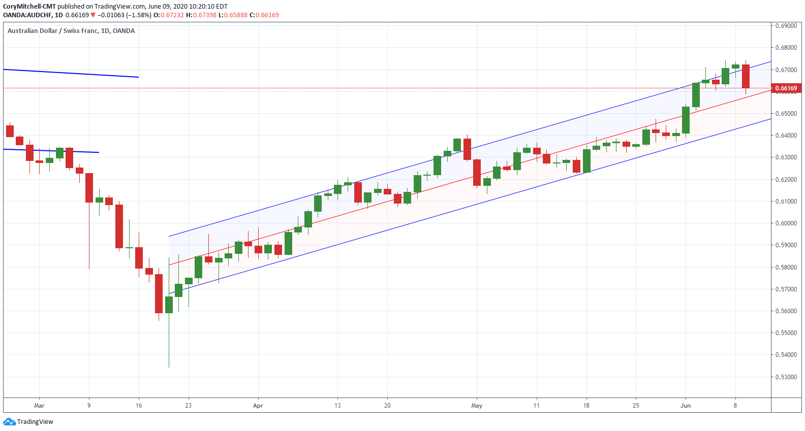
TradingView – June 2020
Mataf provides currency indexes on EUR, USD, GBP, CHF, JPY, CAD, AUD, and NZD. The index is an average of the movement of the currency against the other currencies. Note that most of the currency indexes on TradingView are not based on movements against a basket of currencies…some are only compared to the USD or a tiny basket of currencies. I like the indexes on Mataf because each currency is compared to all the other currencies listed above.
A comparison chart like this is not static. It’s constantly changing as currencies get stronger and weaker. Our job as traders is to attempt to be long the stronger ones and short and weaker ones. We don’t need to do this. It is just an option if it appeals to you.
Let’s look at another example, more short-term in nature.
This chart looks at the last few days of price action. But notice how the chart shows that AUD and CAD started pushing higher as the CHF and JPY dropped. That alerts to some trade possibilities, potentially buying AUD/CHF or CAD/JPY, for example.
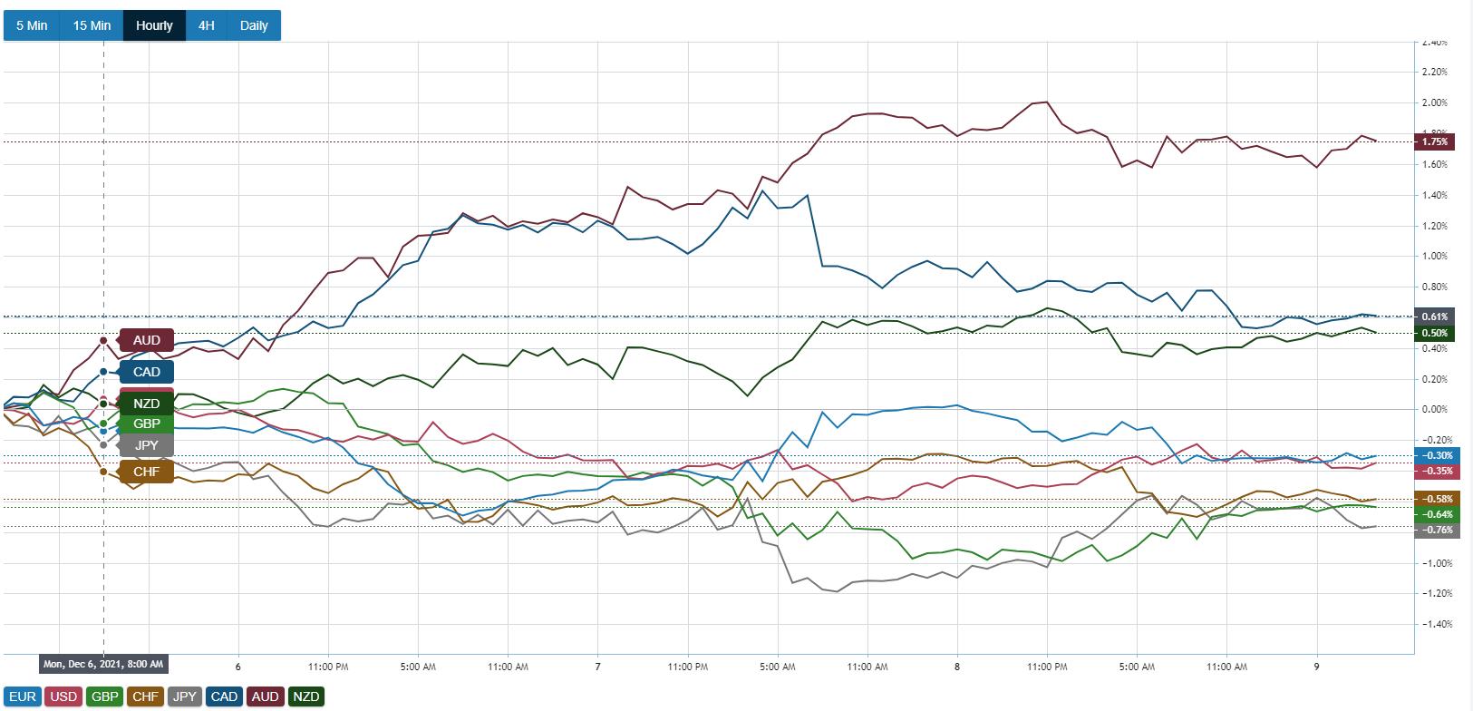
And we can see how this played out in the AUDJPY. Nice strong uptrend, until we start to AUD start to fall off on the right side of the chart.

More recently on the currency index chart, we can see that the CAD is falling the last couple of days, and the GBP has been stronger.
Nice uptrend in the GBP/CAD, and a recent consolidation.
This may seem “coincident” like they are just happening together. And they are! But the point is the currency index chart can help you zero in on where to look for trades, and see which pairs are trending.
Focus on the currencies making the biggest moves, and leave the rest. If something is flat, better to leave it alone.
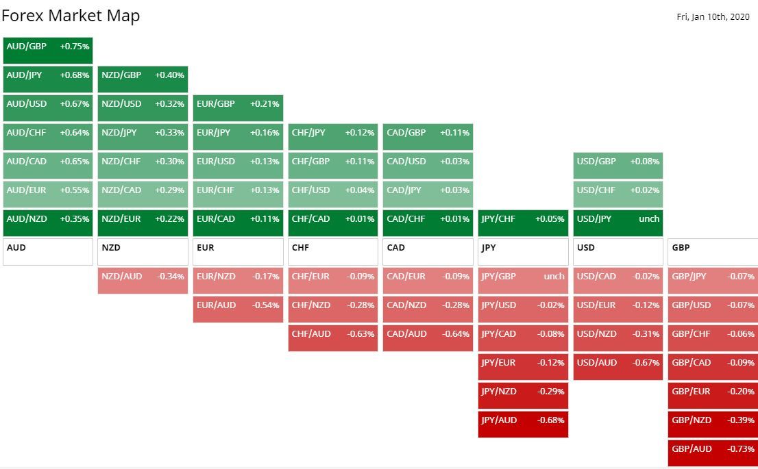
See Which Pairs are Most Affected
Indexes are a basket of currencies, so while they generally do a good job of telling us which currencies are strong and weak, and therefore, what pairs to trade, they may sometimes miss something. For example, maybe the CAD index is really strong, and the JPY index is really weak.
Indexes are based on averages against multiple currencies. It is possible that the JPY could be strong against CAD but weak against everything else, similarly, CAD could be weak against JPY but strong against everything else. So the indexes still show CAD up and JPY down, but CAD/JPY could actually be moving down instead of up. This is the opposite of what we would expect based on the indexes.
Several websites have currency strength tools that show how specific pairs have performed over various time frames.
This provides a quick way to see which currency pairs are up or down the most over the time frame selected.
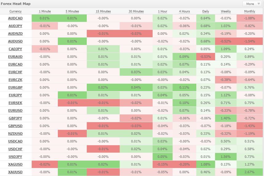
TradingView provides an intraday heatmap (Markets>Currencies>Heat Map. This is good for day traders looking to see what is on the move. However, it only shows intraday data, limiting its usefulness for longer-term traders.
I like the organization of BarChart’s intraday forex heat map.
MyFXBook provides a heatmap with customizable time frames. It covers the most commonly traded pairs.
Final Word
Look to the indexes and heatmaps to help zero in on pairs that are likely to move with vigor. The currency indexes are a great reference and starting point. The heatmaps may help zero in on specific pairs.
For pairs with strong trends and big price moves, consider using Renko charts to capture big profits.
Going through this process is definitely not a requirement. There are many ways to trade. But if is an option to include in your trading plan if you find helpful.
Want to learn how to trade like this? Check out the EURUSD Day Trading Course. It covers strategies for crushing the EURUSD in two hours or less, as well as mental game work and exercise to get in the profit-making zone and stay there.
By Cory Mitchell, CMT.
Disclaimer: Nothing in this article is personal investment advice, or advice to buy or sell anything. Trading is risky and can result in substantial losses, even more than deposited if using leverage.
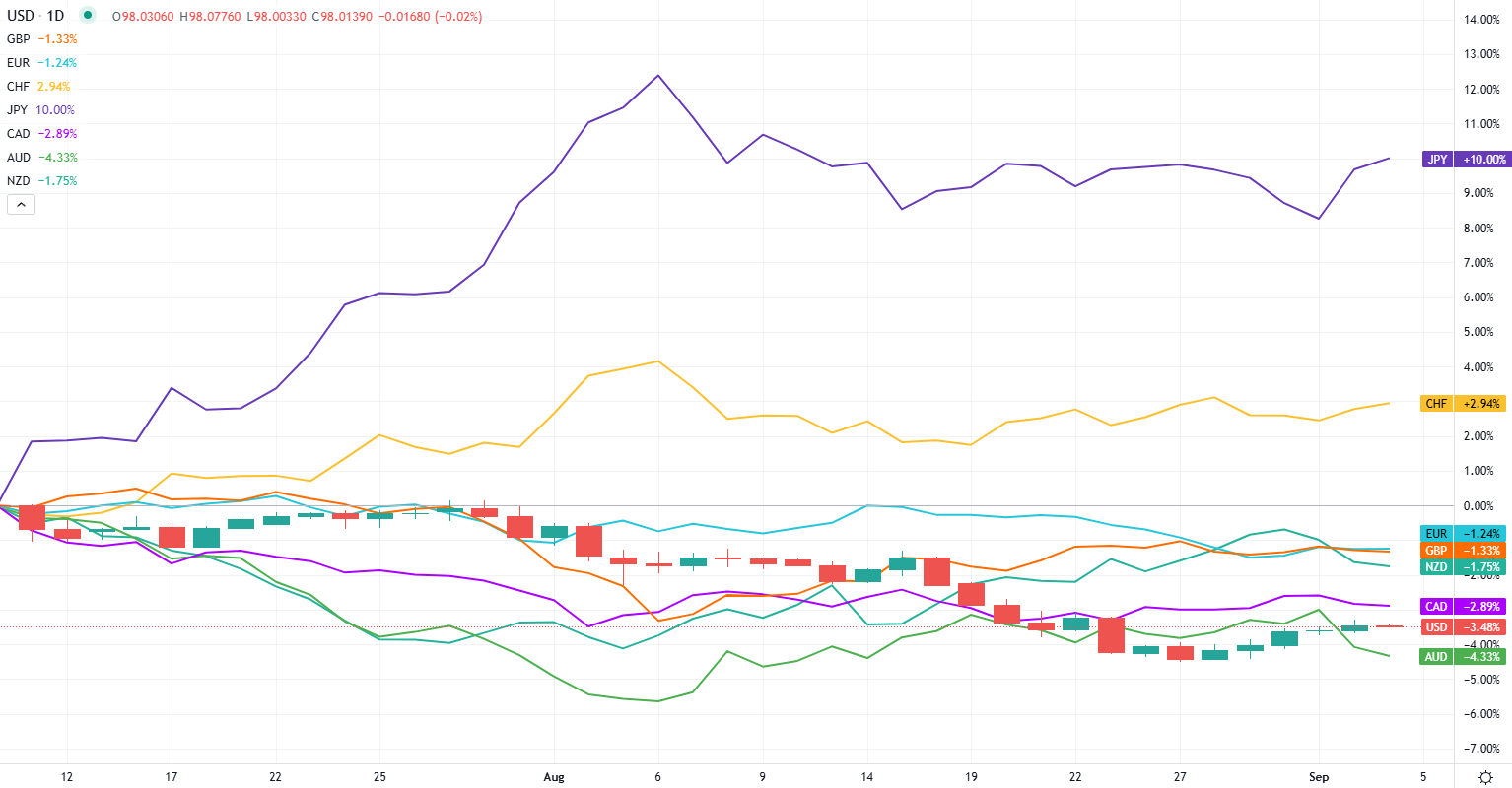
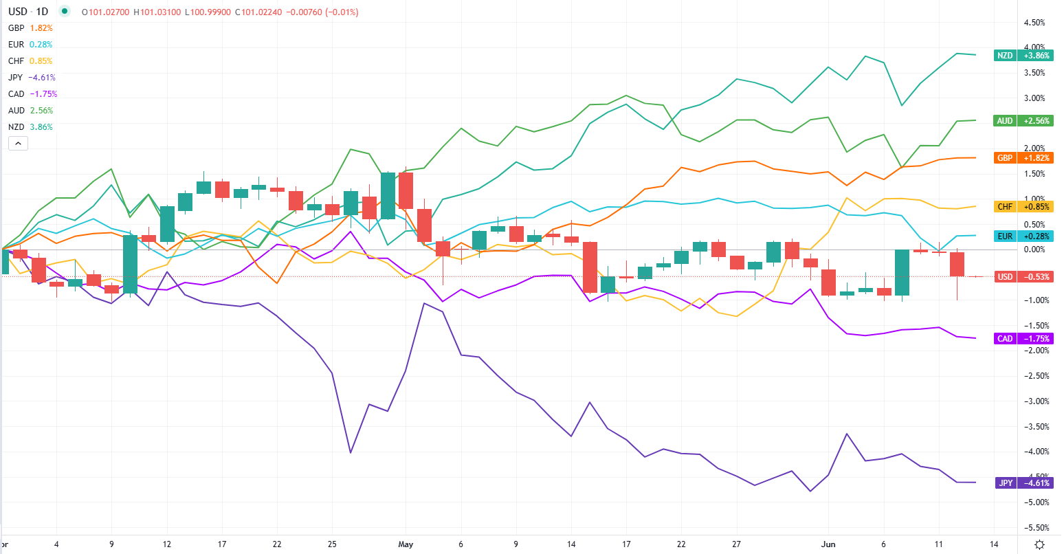
Historical Currency Strength
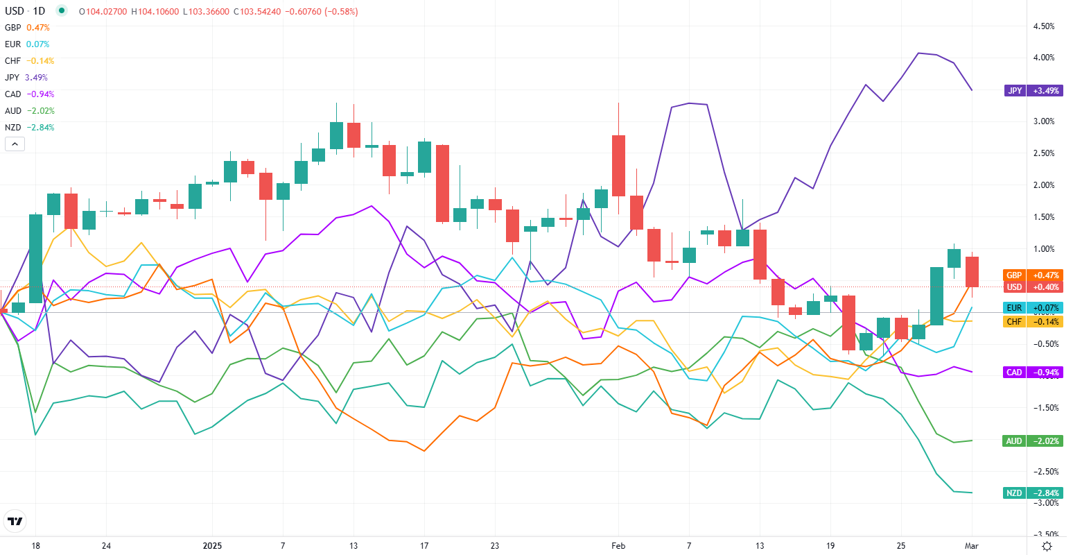
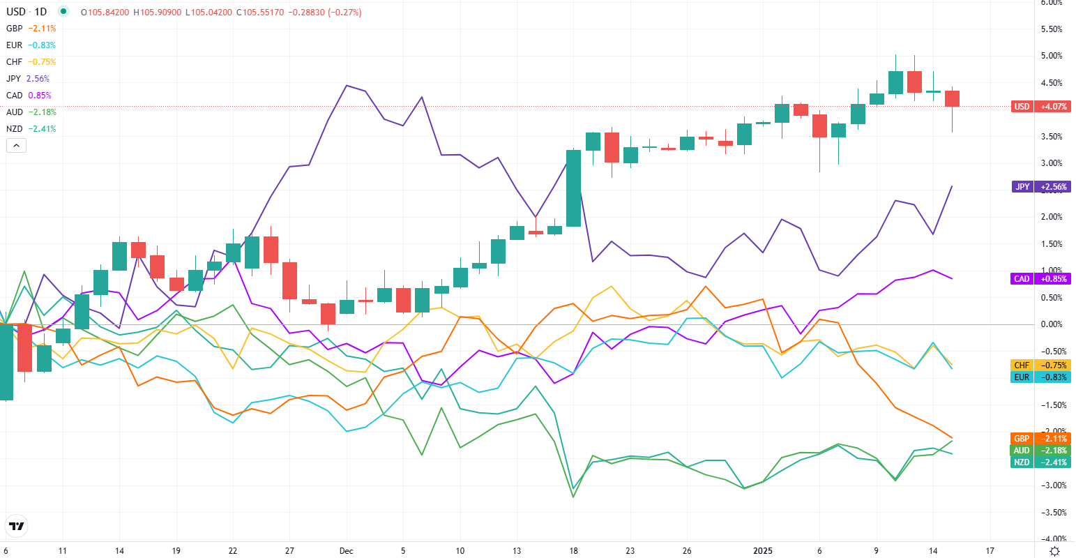
The following chart was updated on March 11 at 10:30 am Eastern Time.
The following chart was updated on March 3, 2025 at 11 AM Eastern.
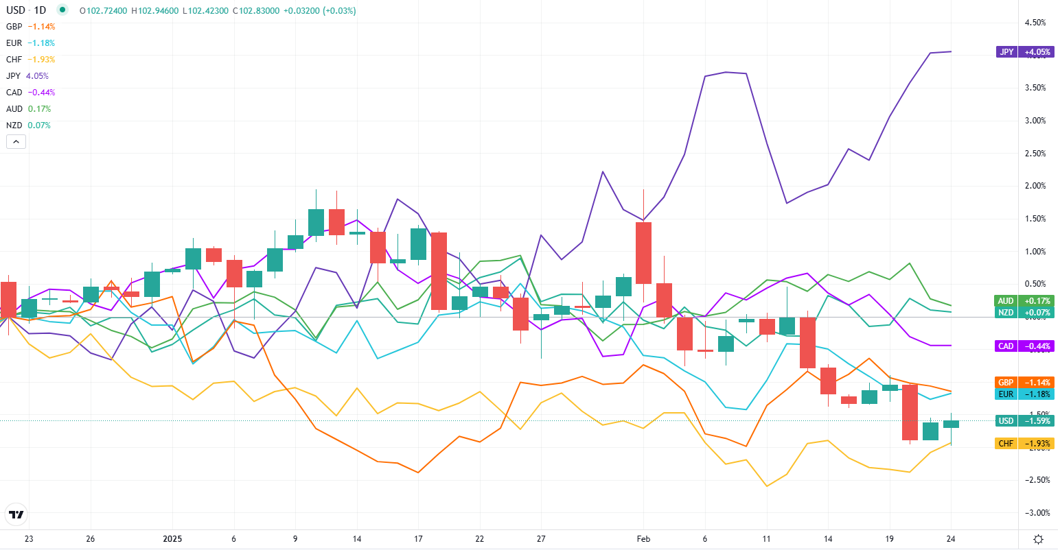
The following chart was updated on Feb. 24, 2025 at 10:50 am Eastern.
The following chart was updated on Feb. 2, 2025.
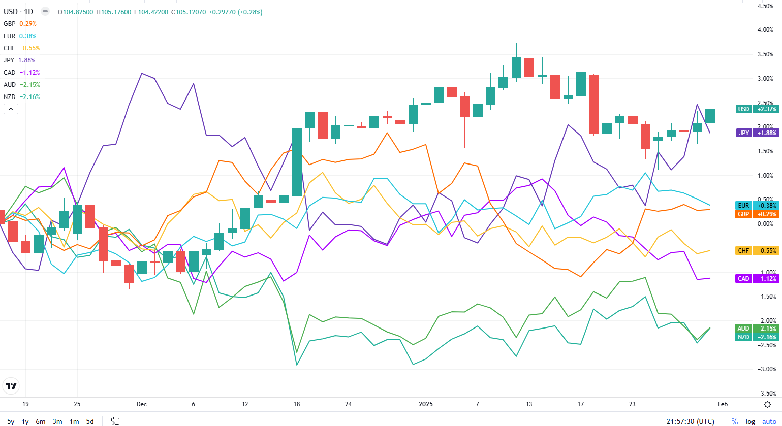
The following chart was updated on Jan. 20, 2025 at 12:55 pm Eastern.
The following chart was updated on Jan. 15, 2025 at 1:15 pm Eastern.
The following chart was updated on January 6, 2025 at 11 am Eastern.

The following chart was updated on Dec. 30, 2024, at 10:22 am Eastern

The following chart is from Dec. 9, 2024

The following chart was updated on Nov. 27 at 2:37 pm Eastern.

The following chart was updated on Nov. 18 2024, at 8:35 pm Eastern.

The following chart was updated on Nov. 11, 2024, at 9:53 am Eastern.

The following chart was updated on Nov. 4, 2024, at 12:10 pm Eastern.

The following chart was updated on October 28, 2024, at 2:06 pm Eastern.

The following chart was updated at 5:52 PM Eastern on October 21, 2024.

The following chart was updated on October 15, 2024, at 10:40 am Eastern.

The following chart was updated on October 8, 2024, at 10:42 am Eastern

The following chart was updated on September 30, 2024, at 11 am Eastern.

The following chart was updated on September 23, 2024, at 11:50 am Eastern.

The below chart was updated on Sept 16 at 11 am Eastern.

The following chart was updated on September 9, 2024, at 9:03 am Eastern.

The following chart was updated on September 3, 2024, at 8:40 pm Eastern.
The following chart was updated on August 12, 2024 at 11:02 am Eastern.

The following chart was updated on August 6 at 3:18 pm Eastern.

The following chart was updated on July 29 at 7:50 pm Eastern.

The following chart was updated on July 22, 2024 at 3 pm Eastern time.

The following chart was updated on July 15 at 4 pm eastern time.

The following chart was updated on July 8 at 3:20 pm Eastern time.

The following chart was updated on July 1, 2024.

The following chart was updated on June 24 at 11:07 am Eastern.

The following chart was updated on June 24, 2024, at 5:20 pm Eastern.

The following chart was updated on June 12 at 9 pm Eastern.
The following chart was updated on June 5, 2024, at 11:18 am Eastern.

The following chart was updated on May 28, 2024, at 9:25 am Eastern time.

The following chart was updated on May 20 at 5:22 PM Eastern.

The following chart was updated on May 13, 2024, at 11:33 am Eastern Time.

The following chart was updated on May 6 at 9:55 am Eastern.

The following chart was updated on April 29 at 11:52 am Eastern Time.

The following chart was updated on April 22, 2024, at 11:49 am EST

The following chart was updated on April 8, 2024 at 10:04 am EST.

The following chart was updated on April 1, 2024 at 1:22 pm Eastern.

The following chart was updated on March 25, 2024 at 2:39 pm EST.

The following chart was updated on March 18, 2024 at 1:45 pm Eastern time.
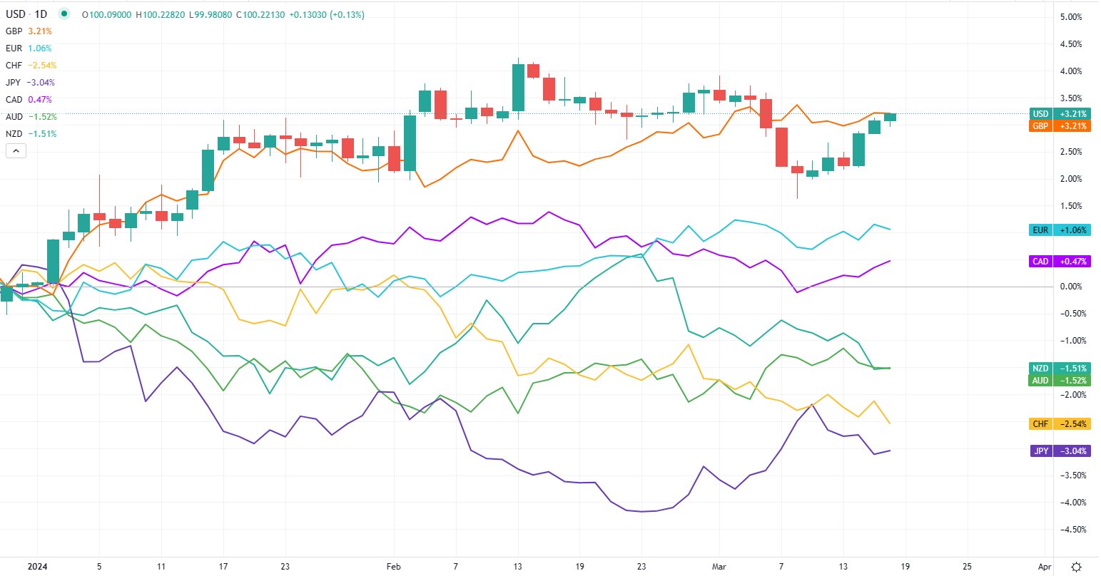
The following chart was updated on March 11, 2024
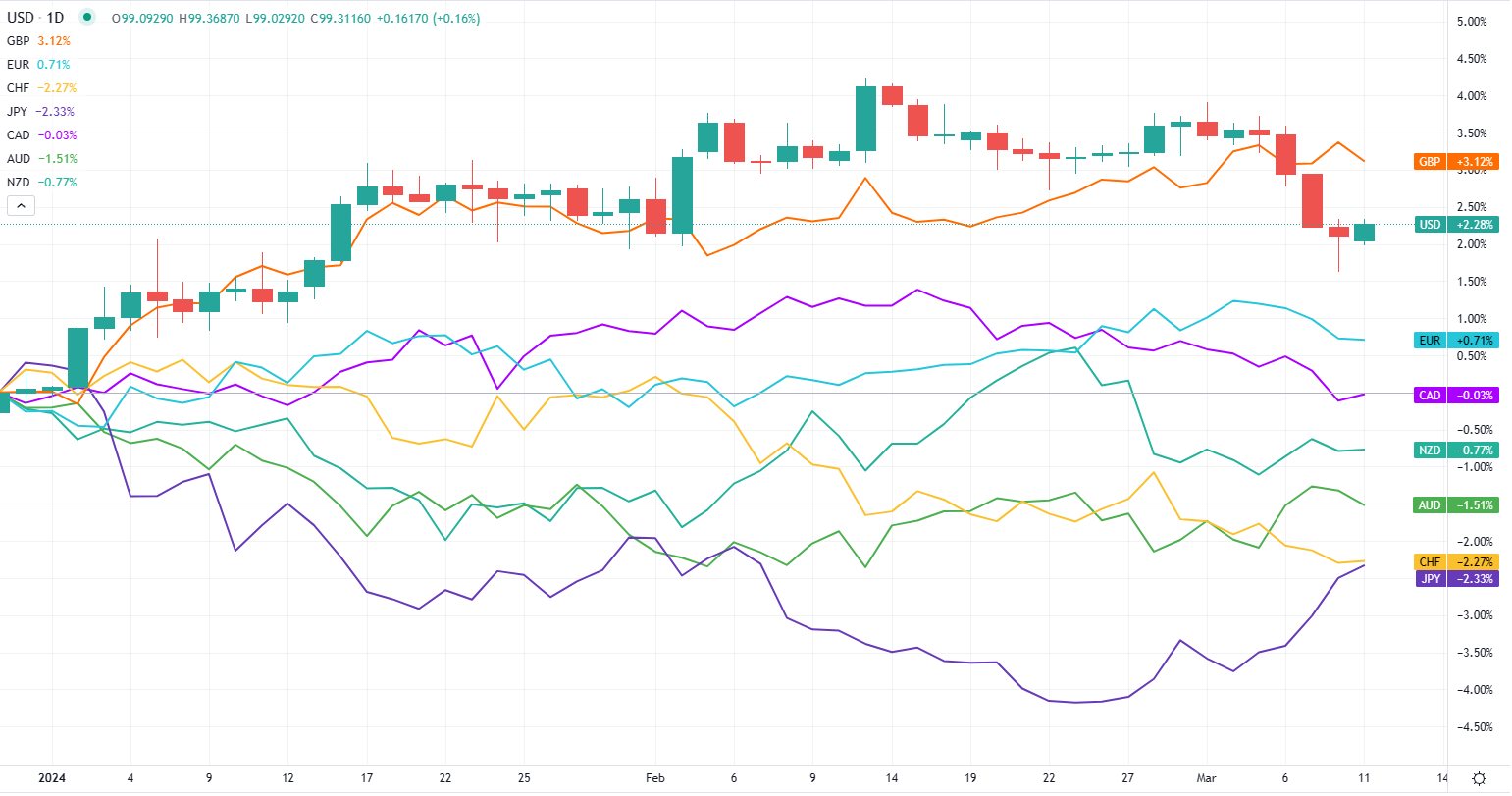
The following chart was updated on March 4, 2024 at 2:32 pm EST

The following chart was updated on February 26, 2024 at 11:32 AM EST.
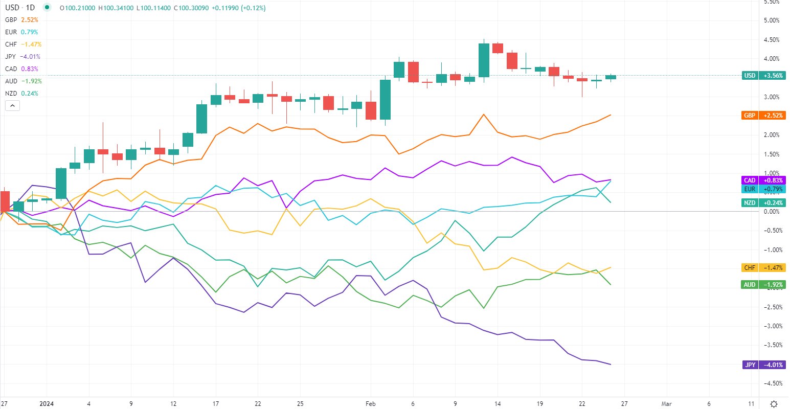
The following chart was updated on February 20, 2024, at 11:32 am EST.
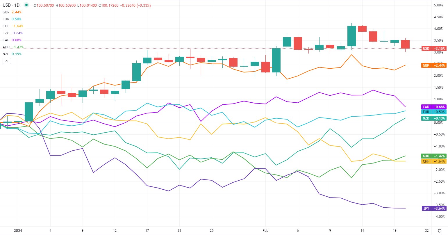
The following chart was updated on February 12, 2024, at 11:42 am EST.
The following chart was updated on February 5, 2024 at 10:40 am EST.

The following chart was updated on January 29 at 10:23 am EST.


9 Comments
Leave your reply.